Report Generated: 2026-05-13 02:02:10 Alaska Time
Analysis North Solar Data
Back to Analysis North Website
A 2.85 kW-DC grid-connected photovoltaic solar system is installed at the Analysis North office in Anchorage, Alaska (Alan Mitchell’s residence). The system consists of ten 285 Watt SW 285 SolarWorld panels coupled to ten Enphase S280 microinverters with a total capacity of 2.80 kW-AC. The system is roof-mounted, tilted at 45 degrees and oriented 8 degrees West of South. 
The graphs below summarize the performance of the system to date. These graphs are updated every hour; press F5 to have your browser refresh the data.
The code for acquiring the solar data and creating this page is available at Alan Mitchell’s GitHub site.
Recent Production
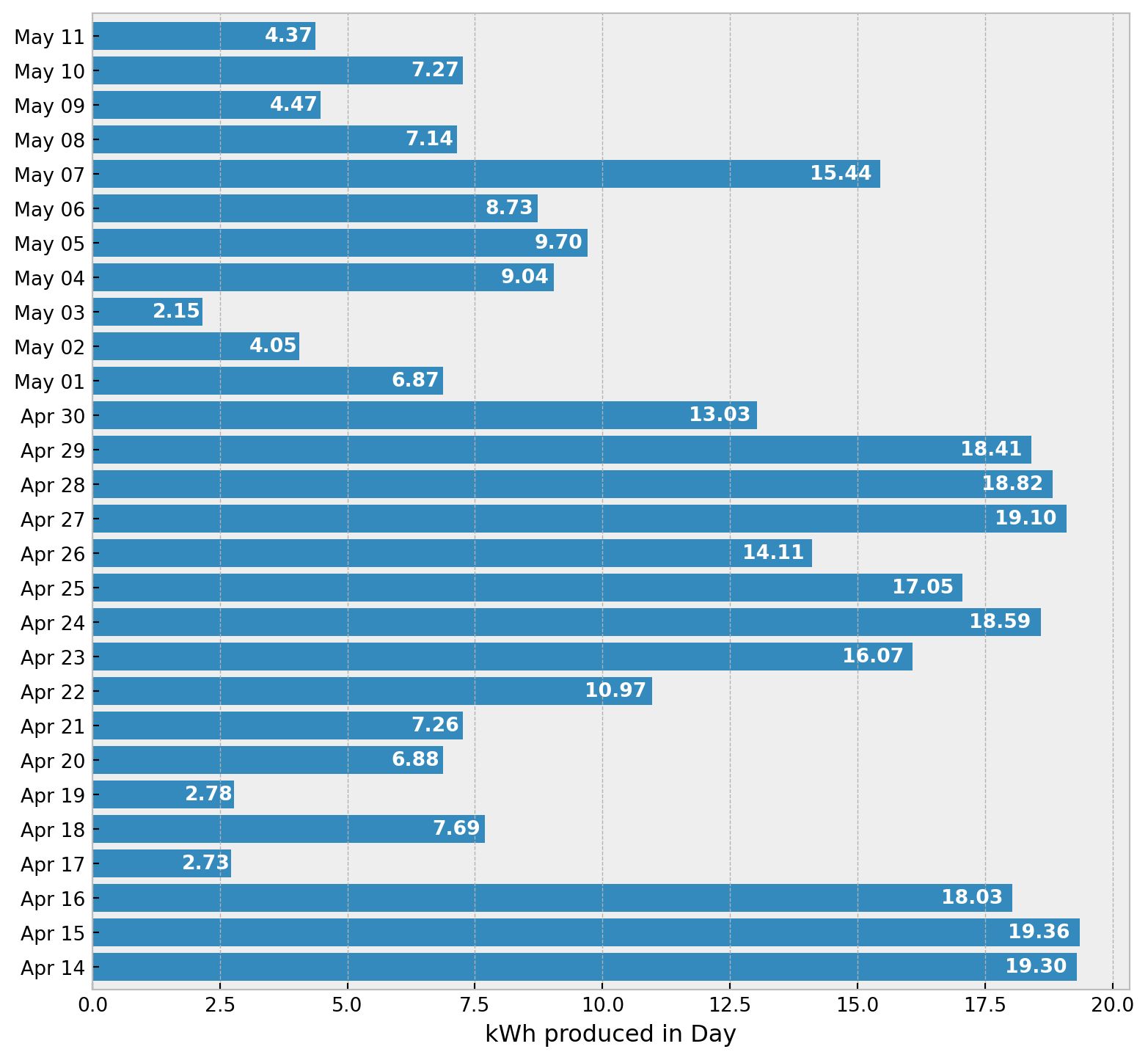
This shows the daily energy production from the system for the last four weeks. Note that the most recent day, shown at top, could be a partial day or could be the last day that had non-zero production.
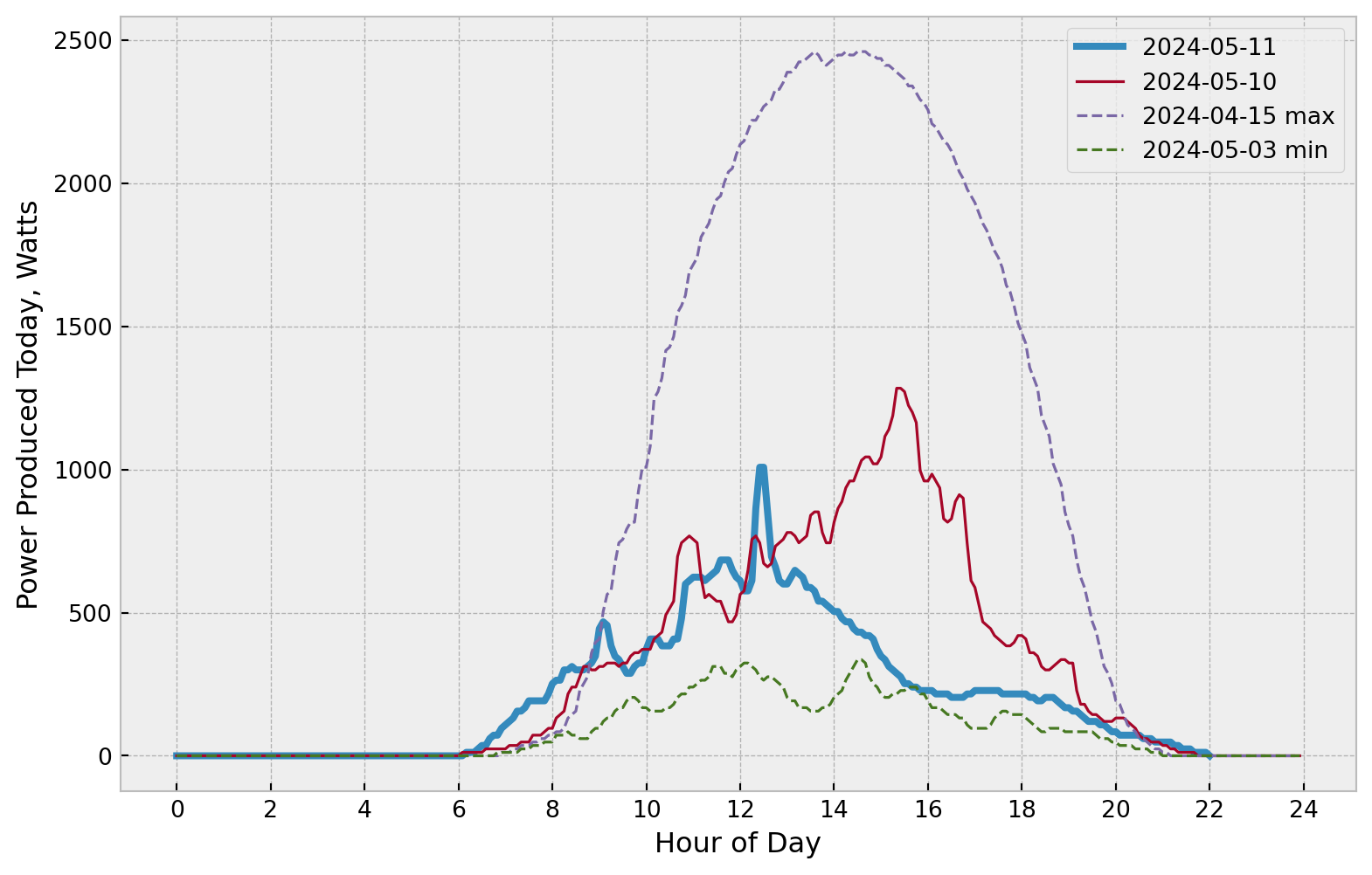
Here is a graph of the power production today (thick blue line), yesterday (thin red line), and the days with minimum and maximum energy production during the last four weeks (thinner dashed lines):
Cumulative Energy Production for the Year
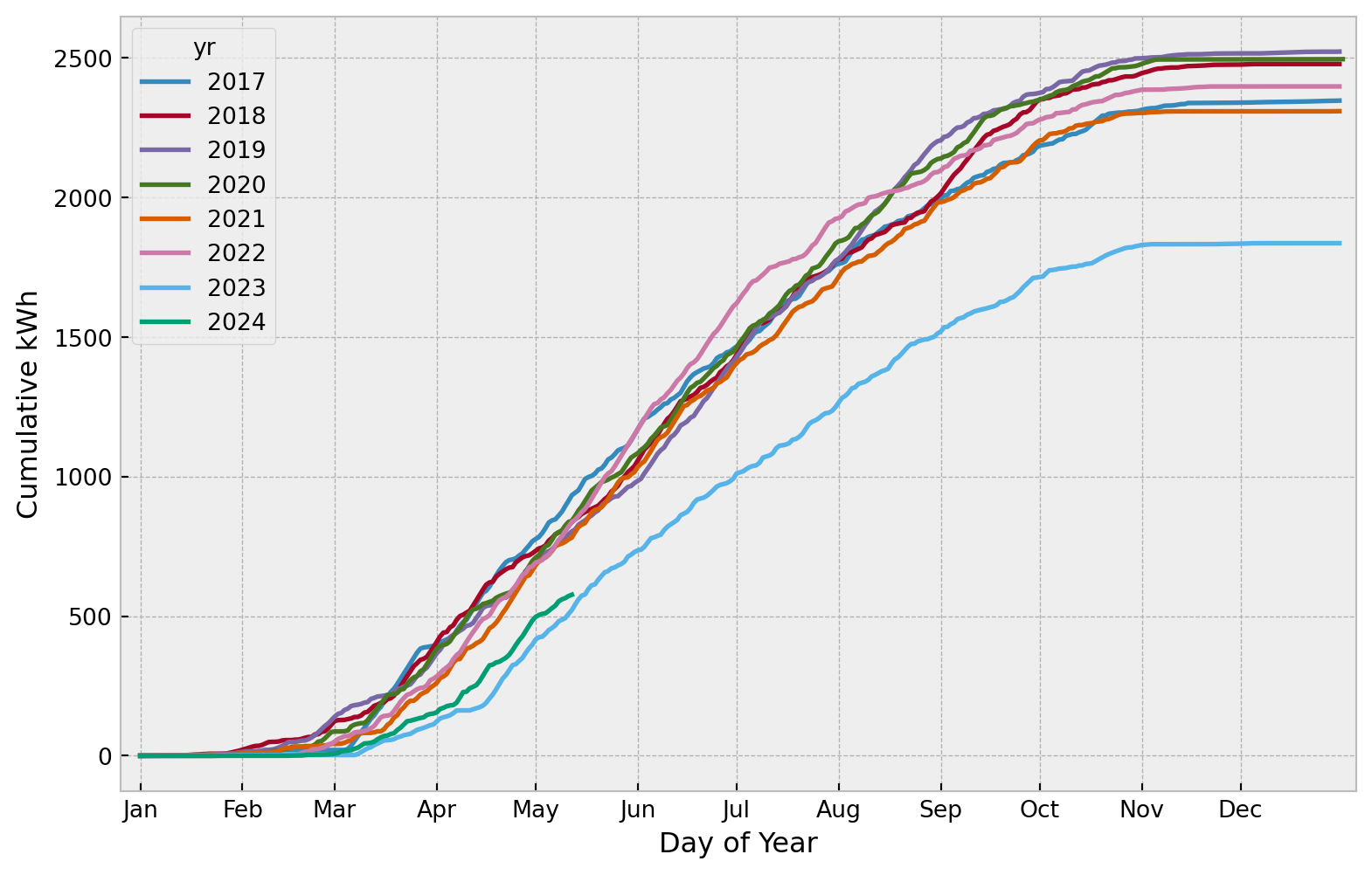
This graph shows the cumulative energy production of the system for the current year and for all previous years as separate lines. For example, a value of 300 kWh on the Y-axis for March 20 means that a total of 300 kWh were produced for the days of the year prior to March 20.
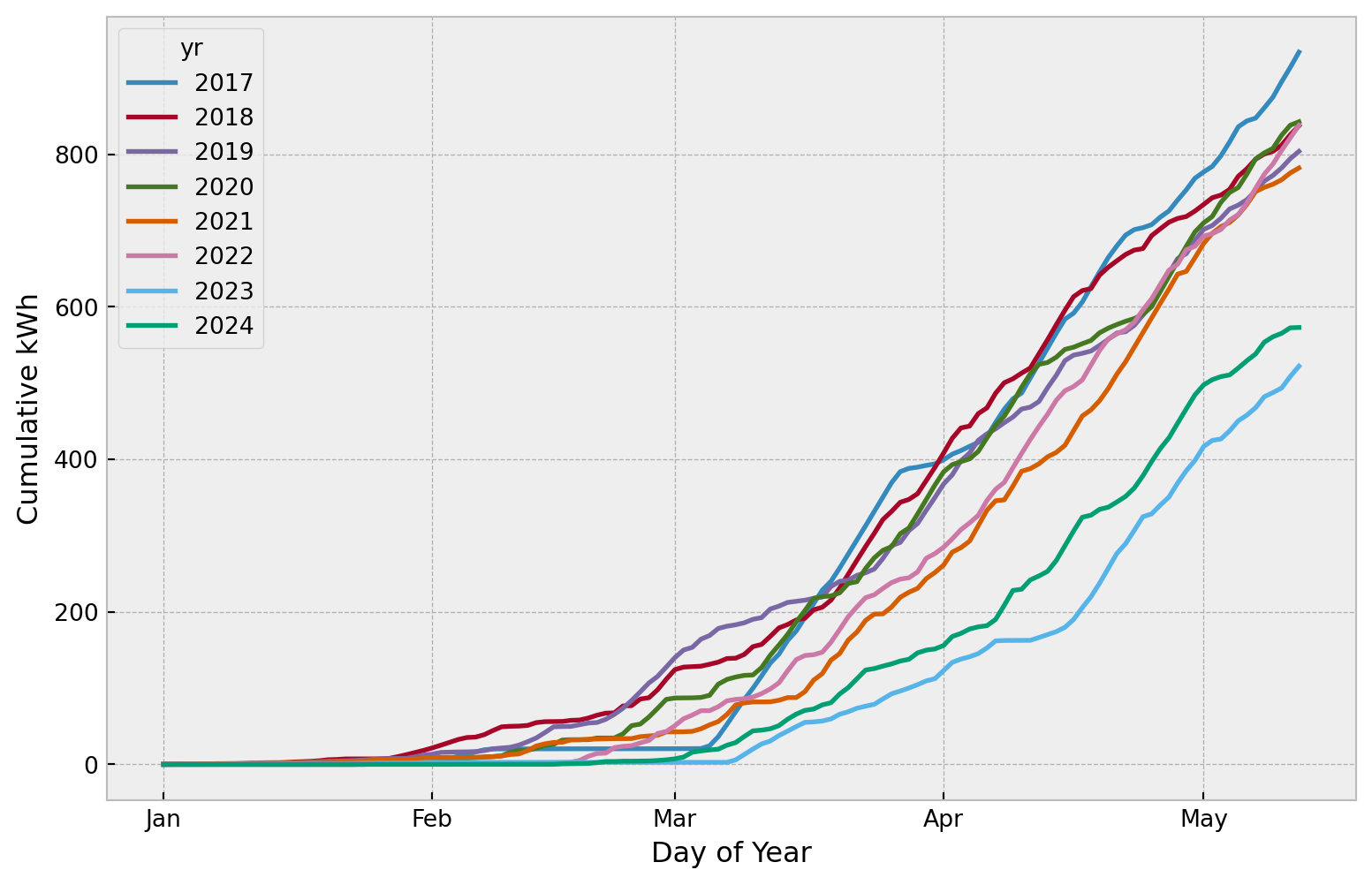
This graph below is the same as above except it does not show days of the year beyond the current day.
Monthly Energy and Power
This graph shows the total number of kWh produced in each month; each year is shown on a separate line so monthly comparisons between years are possible; the black dotted line is the average monthly production across all years. Note that the most recent month is usually a partial month so will appear to have a low value. This is an interactive graph where you can click and double-click individual years in the legend to turn them On or Off in the graph.
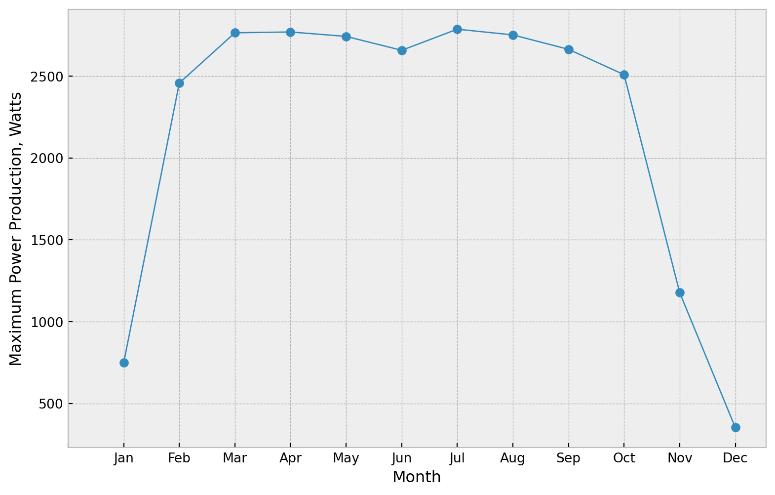
This graph shows the peak power production that has occurred in each month. It finds the peak power across all of the years of data for each month.
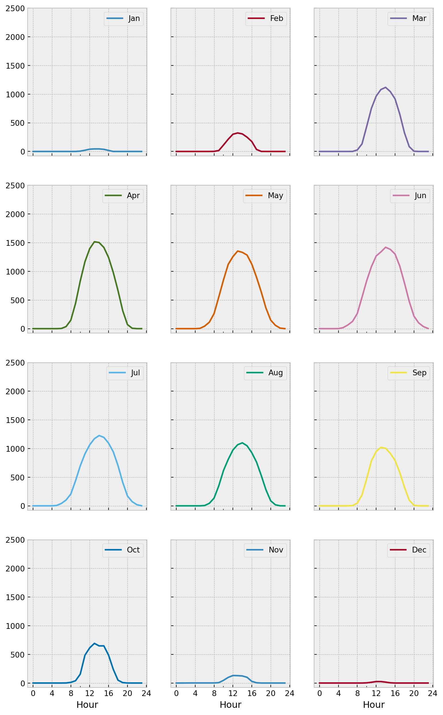
Below, an average production profile is shown for each month. The Y-axis value is average power in Watts produced for the hour (0 - 23) shown on the X-axis.
Spread of Daily Production Values
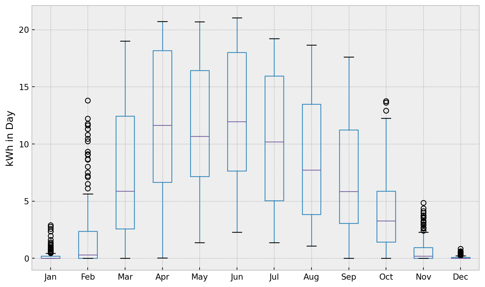
This boxplot show the spread and the median daily energy production values for each month.
In the plot below, each dot is data from one day. The Y-axis value is the kWh energy produced during the day, and the X-axis value is the day of the year. So, the graph also is good at showing the distribution of daily energy production values that occur at different times of the year. Hovering over a point will show the Date associated with the point. The three large red points are the last three days. You can click-and-drag to zoom in on a sction of the plot.
Record-Setting Days
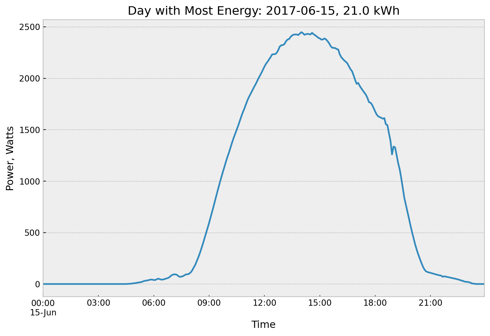
Here is the day where the most kWh were produced:
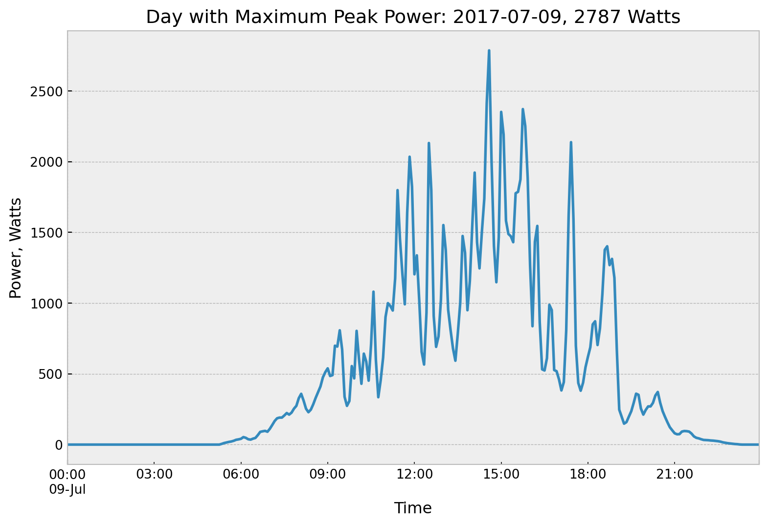
Here is the day that had the highest 5 minute power production. This is generally a day where the solar noon sun comes out from behind some clouds. As well as the solar panels receiving the direct sun, they also receive substantial radiation from sun rays redirected as they pass through the clouds adjacent to the sun.
An Important Number: Normalized Annual Production
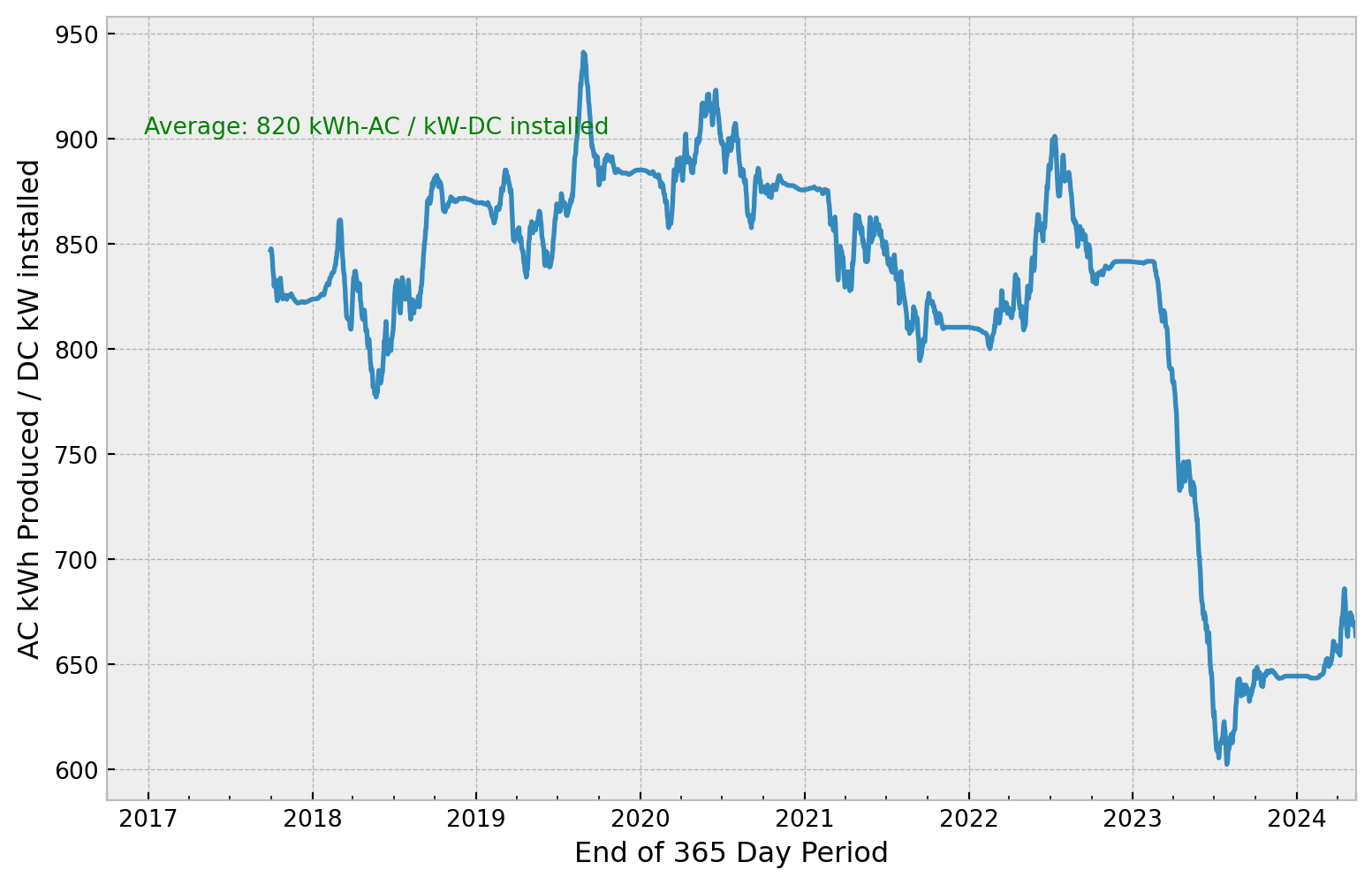
Here is a graph of an important performance number for the system. If you take the production of the system for a year in kWh (AC delivered to the grid) and then divide by the rated capacity of the system in kW (rated DC panel capacity), you have calculated normalized annual production for the system. For example, a normalized production of 850 kWh-AC / kW-DC means that each 1 kW of rated capacity in this system produces 850 kWh-AC of electricity for the year. For this particular system, this number will vary due to how sunny the year is, dirt and snow accumulation on the panels, and due to general degradation of output over time. When comparing to other systems, the number will vary due to additional factors such location of the system, tilt and orientation, shading, etc. Normalized production in California is quite a bit more than Alaska.
The graph below plots this normalized production on rolling year basis. The first point shown below is for October 1, 2017 and has a value of about 848 kWh / kW. That means for the 365 days prior to October 1, 2017, the system produced 848 kWh for each 1 kW of installed capacity. Each additional point on the line indicates the normalized production for the 365 days preceding the date on the horizontal axis.
All data analysis and graphing is custom programming done by Analyis North and is available at Alan Mitchell’s GitHub site.